*Branding with Turtl* Brand Editor
A how-to guide for producing a Standard Brand using the Brand Editor tool
Please note: this feature is enabled for customers who have purchased Brand Center access, in all other instances, the Turtl team will use Brand Editor on your behalf.
A guide to the variables that can be adjusted in a Standard Turtl Brand Theme via Theme Creator
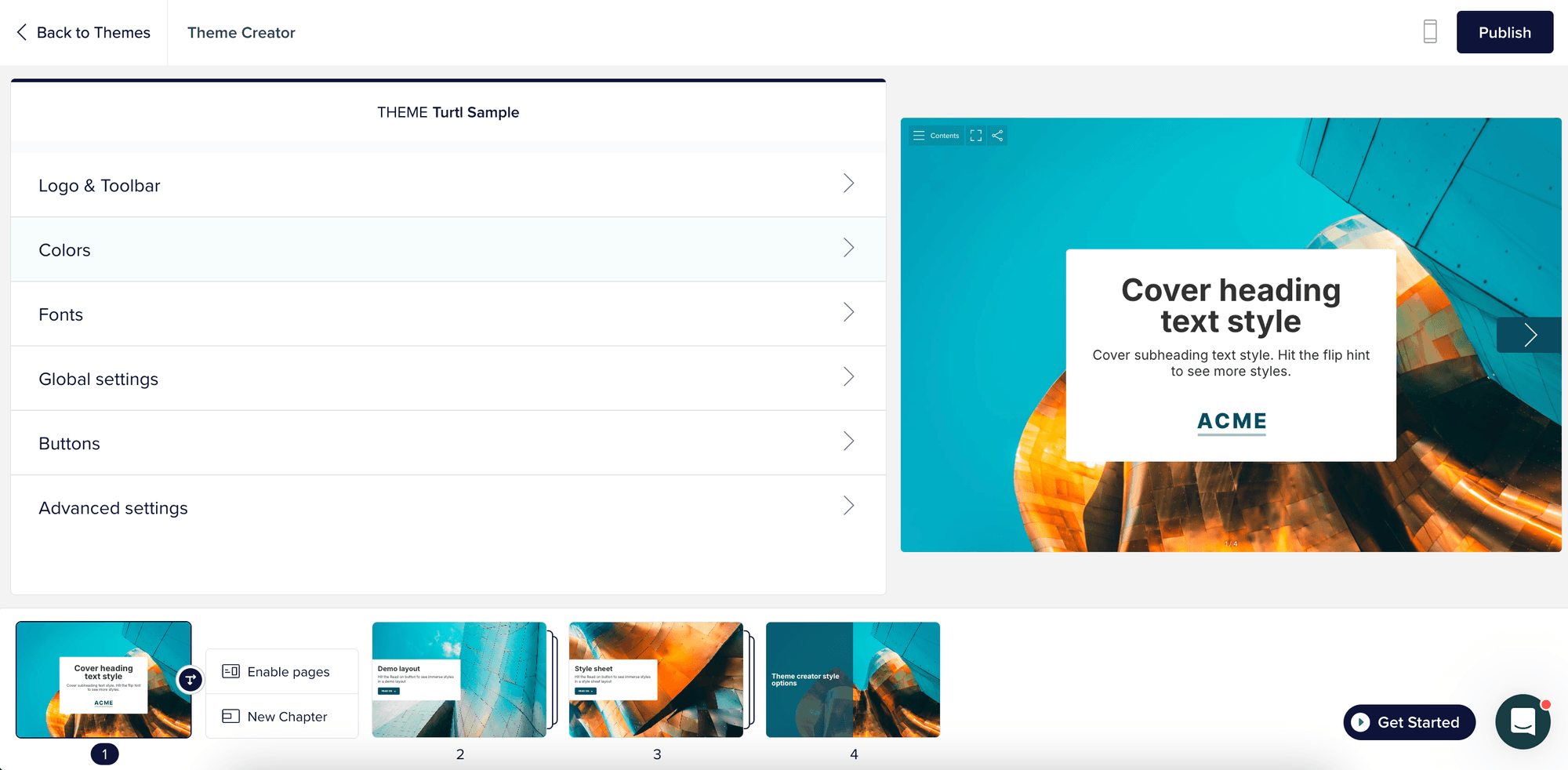
BRAND EDITOR GUIDE
Toolbar & logoColorsFontsGlobal SettingsButtonsAdvanced Settings (expert only)
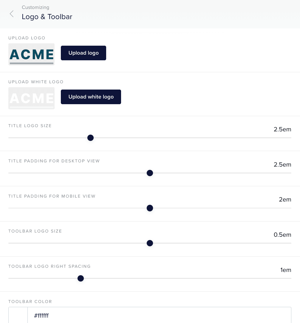
Toolbar color (set to white by default)
Brand logos we advise color and white versions in SVG format
Logo size for both the toolbar and Title page
Logo spacing options
Advanced logo placement
Secondary logo upload (co-branding, although this can be achieved as a workaround with two files in a single upload)
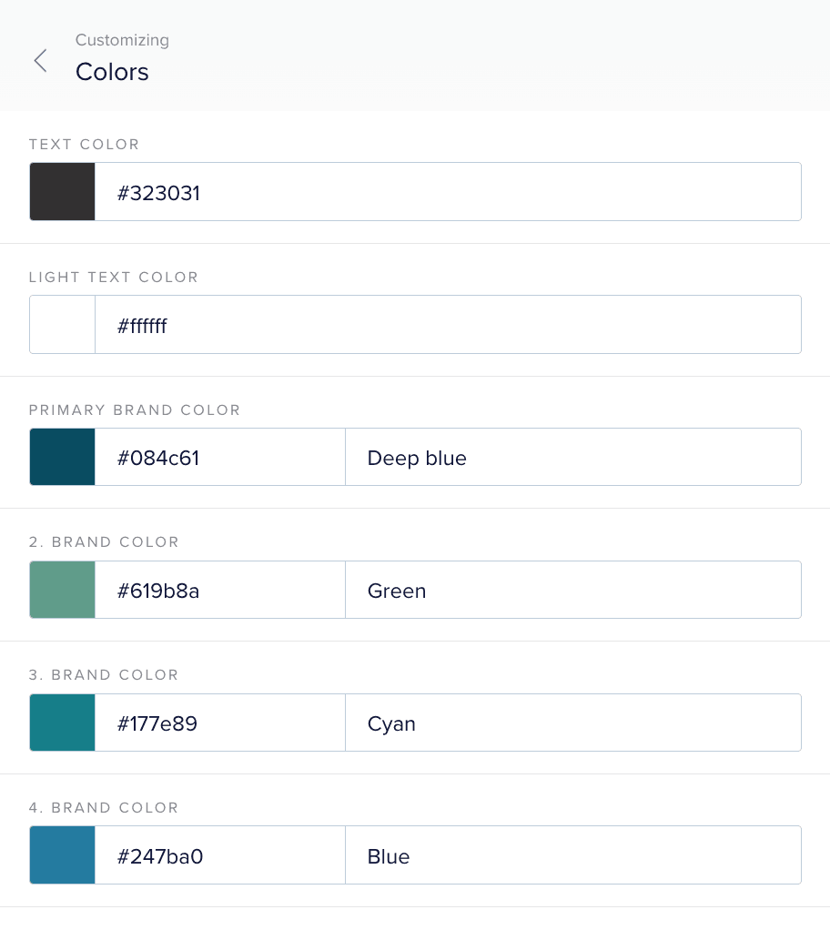
Text color for body text
10 brand colors maximum (excluding white #ffffff which is included by default)
Primary brand color sets the color of flip hint, read-on buttons and social sharing buttons
3 Content page backgrounds in white, text colour and primary brand color
Gradient color options
Custom button color per background
Limiting colors according to Chapter or Content pages
Custom Chapter page artwork
Additional Content page background colors
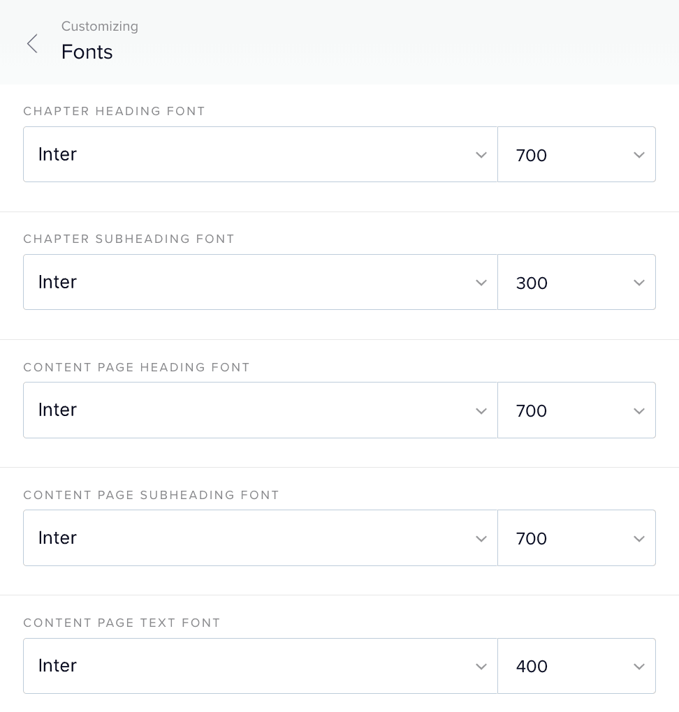
Standard Themes use Google Fonts. Non-Google fonts (i.e. Adobe or official brand fonts) can be added at additional cost, see below.
Title/Chapter page heading
Title/Chapter page subheading
Content page headings - Extra large, large, mid-large and mid
Content page text - Large, normal, small and extra small
Quotes - Large, mid, small
Button text
This comes at an additional cost of £400 / $520. Please request.
Advanced typography
Additional font size options
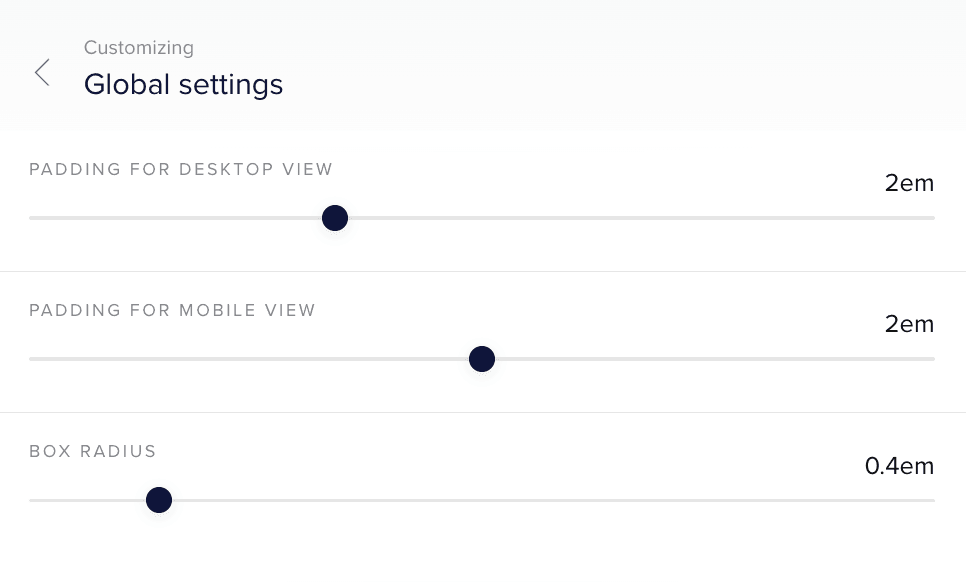
Text box padding for landscape and mobile view
Box radius to set the roundness of Title/Chapter and Content page boxes
Custom Title/Chapter page styles
Custom Content page widget styles
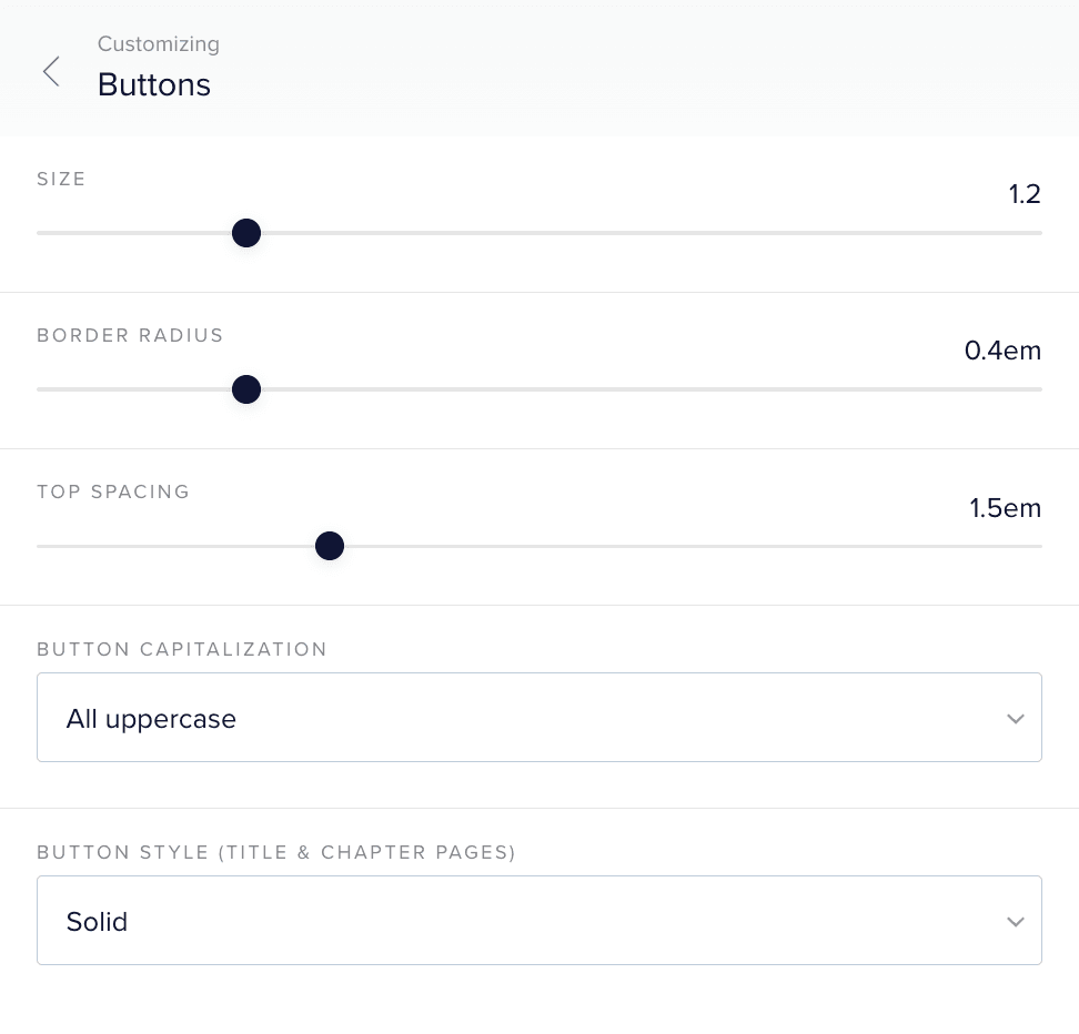
Button size for read-on buttons
Button border radius to make buttons square or rounded
Button capitalization to set the text to uppercase or lowercase
Button style to apply either a solid or outline style
Custom button styles on Chapter and Content pages
Custom wording of buttons