Whether you are a designer or not, follow the tips in this chapter to elevate the look and feel of your content.
Do my chapters look consistent in terms of design and styling?
Do my Immerse chapters have consistent heading structures e.g. Main Headings, Sub Heading, Bold, Bullet Points.
Have I used multiple Immerse column structures (ideally 3-5) to give me more design flexibility?
Are widgets stretched over columns to add interest to the page and encourager interaction?
Is the layout of text, images and widgets clear enough to get my message across?
Could I introduce white space to let interactions take center stage?
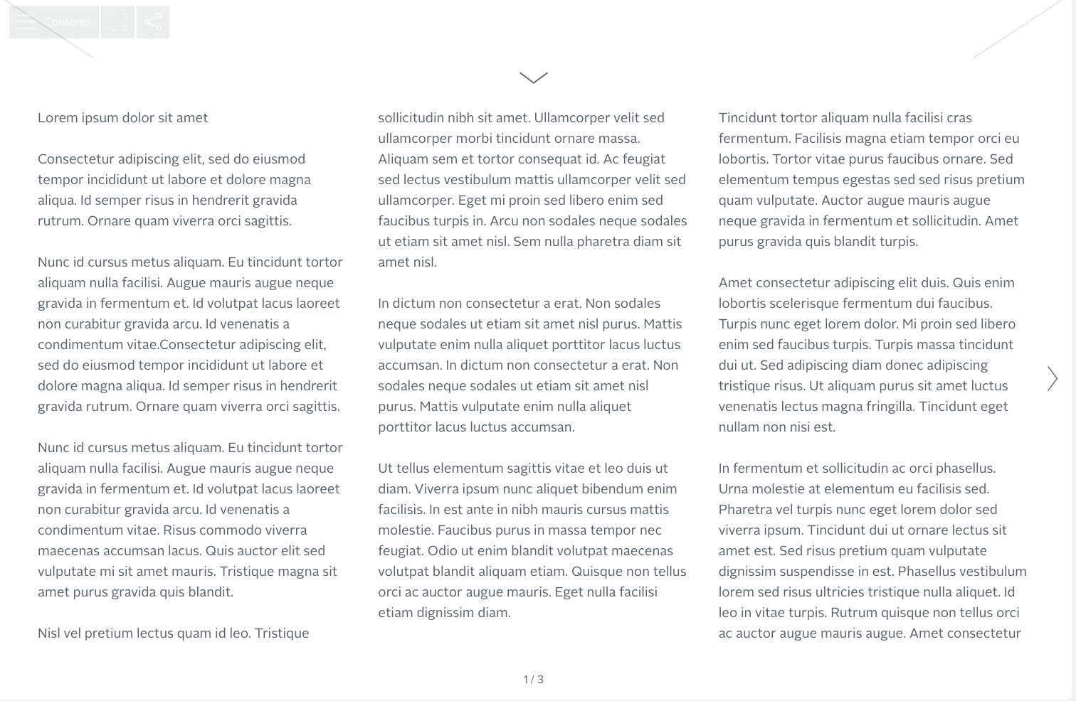
Example of a Doc with no design structure: A text heavy page with no interactivity or colors can lead your readers to stop reading.
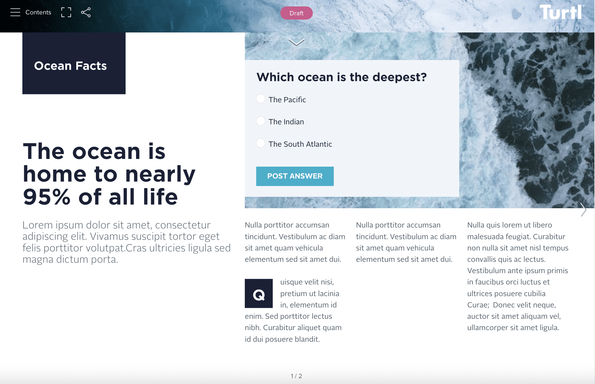
Example of a Doc with white space and layering: By layering, incorporating varying text sizes and including the poll widget, these simple changes transform a page and make it appealing to the eye.
Use at least 3-5 columns on the Immerse level for more design flexibility.
Pin and layer widgets to create more interesting layouts.
Include a heading at the start of each Immerse chapter to anchor the reader.
Use consistent heading styles to guide readers through sections.
Don't over-do it and include too much information and interactivity on one page.
Don't be afraid of white space which helps readers to absorb information more easily.